Grid Gap
When we create grids (in the form of rows and columns), we need a little space between them—like a little gap between boxes. This space is called a Grid Gap.
This gap:
Exists only between items within the grid. It does not apply to the outside or border of the container. You can control the gap in both vertical (up-down) and horizontal (right-left) directions.
Gap Properties are:
- row-gap
- column-gap
- gap(shorthand)
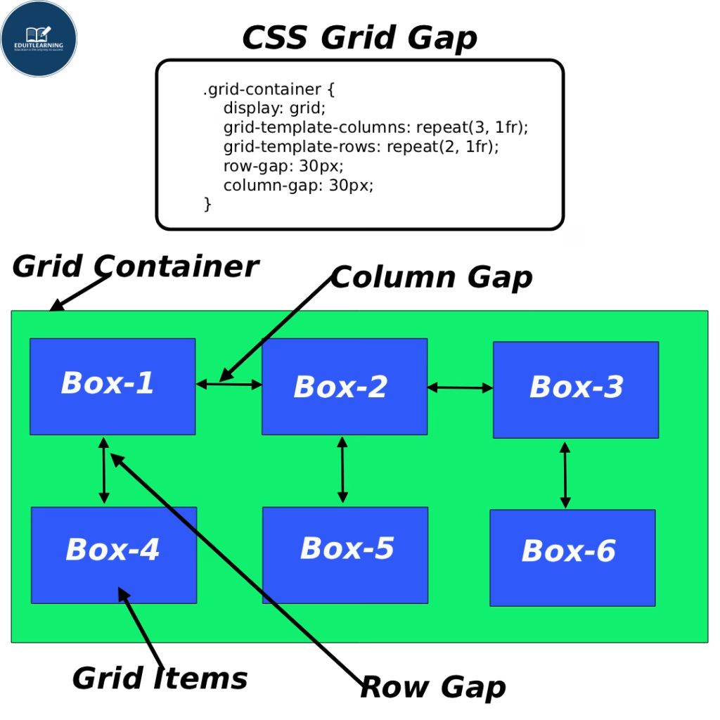
row-gap
This property sets the gap between rows of the grid (the distance between the top and bottom).
Example:
row-gap: 20px;
Meaning:
- There will be a 20px gap between each row.
- If there are 3 rows, then:
- 20px between Row 1 and Row 2
- 20px between Row 2 and Row 3
- This only controls the gap between rows, not columns.
column-gap
This property sets the gap between the columns of the grid (the distance from right to left).
Example:
column-gap: 30px;
Meanig:
- There will be a 30px gap between each column.
- If there are 3 columns:
- 30px between columns 1 and 2
- 30px between columns 2 and 3
- This only controls the gap between columns, not rows.
gap(Shorthand)
Gap is a shortcut (shorthand property) used to define both row gap and column gap simultaneously.
You can write both gaps on one line.
Syntax 1: Both same gap
gap: 20px;
Meaning:
- Row gap = 20px
- Column gap = 20px
- Same spacing in both directions.
Syntax 2: Alag-alag gap
gap: 10px 30px;
Meaning:
- First value (10px) = row-gap
- Second value (30px) = column-gap
- 10px gap between rows
- 30px gap between columns
Important Points
- Gaps are not applied within items, but only between items.
- This spacing is automatically managed; you don’t need to apply margins.
- The gap property also works in grids and flexbox (in modern browsers).