CSS Grid
CSS Grid is a layout system used to arrange the elements of a web page in rows and columns. This allows us to give a proper structure to our web page design – just like a table, boxes (items) in a grid can be set up line by line and column by column. CSS Grid makes designing modern websites very easy and flexible.
Grid Layout
Grid Layout is a two-dimensional system — meaning we can control items in both vertical (rows) and horizontal (columns) directions. It gives you a perfectly structured design in which elements are organized like a table.
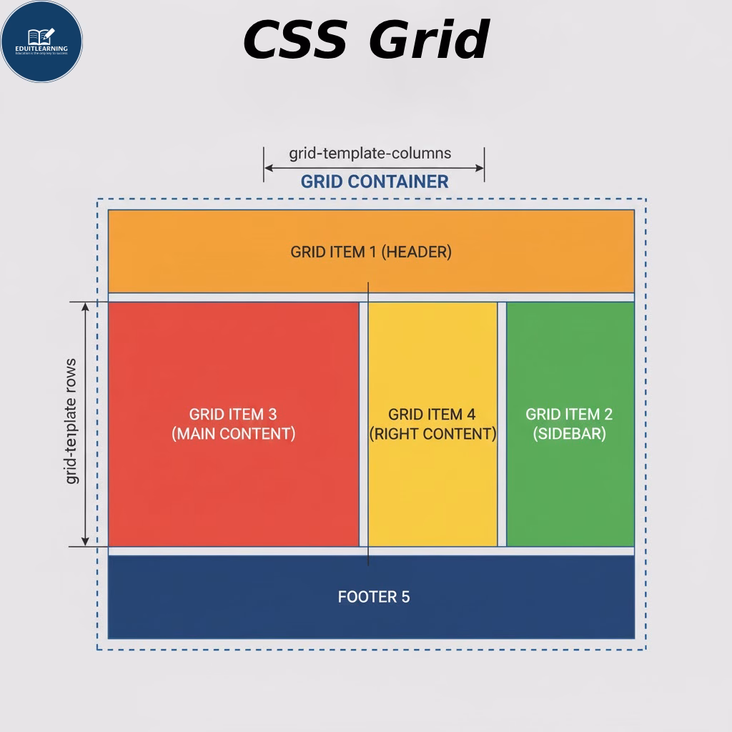
Grid Terminology
- Grid Container: A Grid Container is the parent element to which we apply the Grid layout. When we set display: grid; to an element, it becomes a Grid Container. All child elements within it become “Grid Items.”
- Grid items: Grid items are child elements within a grid container. Each item resembles a box that fits inside a cell.
- Grid Track: A grid track is a row or column that is part of the grid structure. That is, each horizontal line is called a “row track” and each vertical line is called a “column track.” Tracks are basically the area between two grid lines.
- Grid Cell: A grid cell is a single smallest box in a grid—formed by the intersection of a row and a column. Each grid item can occupy one or more cells.
- Grid Area: A grid area is a larger region made up of multiple grid cells. You can create an area by spreading a grid item across multiple cells. This is a combined section, such as “header”, “sidebar”, “main content”, etc. Grid areas can also be named using grid-template-areas.
- Gutter (Grid Gap): Gutter or Grid Gap is the space that is between the grid cells. It provides a little breathing space between rows and columns so that the items do not appear stuck together. In CSS, we set this with the gap, row-gap, and column-gap properties. This space makes the design clean and readable.