Placing Grid Items
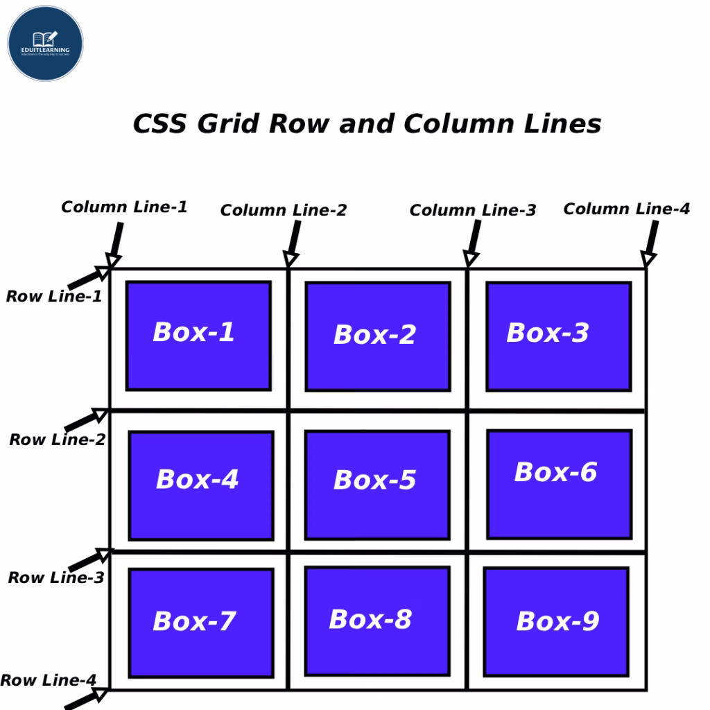
Grid Lines
The dividing lines between rows and columns within a grid are called grid lines. These lines are numbered starting at 1 and increasing according to the number of rows and columns.
Example:
If you defined:
grid-template-columns: 100px 100px 100px;So:
- Column line 1 → before the start
- Column line 2 → between the 1st and 2nd columns
- Column line 3 → between the 2nd and 3rd columns
- Column line 4 → after the end
So when you place an item, you’re basically saying —
“Start this item on line 1 and go to line 3.”
grid-row-start and grid-row-end
These properties indicate which row line an item should start from and which line it should end on.
- grid-row-start → Which horizontal line it should start from (the upper line number).
- grid-row-end → Which horizontal line it should end from (the lower line number).
Example:
.item1 {
    grid-row-start: 1;
    grid-row-end: 3;
}
Meaning:
- Item 1 should start from row 1 and stretch to row 3.
- So it should occupy two rows (row 1 and row 2).
- The item occupies the area between the “Start” and “End” lines.
grid-column-start and grid-column-end
These indicate which column line the item should start from and which column line it should end at.
- grid-column-start → Left side start line.
- grid-column-end → Right side end line.
Example:
.item1 {
    grid-column-start: 1;
    grid-column-end: 3;
}
Meaning:
- Item 1 will start from column line 1 and end at column line 3.
- So it will cover 2 columns (1st and 2nd).
Shorthand Properties
grid-row
Syntax:
grid-row: start-line / end-line;Example:
grid-row: 1 / 3;Meaning:
Start from row 1 and end at row 3.
These are the same:
- grid-row-start: 1;
- grid-row-end: 3;
grid-column
Syntax:
grid-column: start-line / end-line;Example:
grid-column: 1 / 3;Meaning:
Column should start from line 1 and end at line 3.
These are the same:
- grid-column-start: 1;
- grid-column-end: 3;
“span” Keyword
Sometimes you don’t remember line numbers, so you can use the “span” keyword to tell the item how many rows or columns it should occupy.
Example:
grid-row: span 2;
grid-column: span 3;
Meaning:
- This item will stretch across 2 rows
- and spread across 3 columns.
- That is: “Start where you are, and extend 2 rows and 3 columns from there.”