CSS Border-Radius
Have you ever noticed that some boxes, buttons, or images on websites have rounded corners instead of sharp square edges? That is done using border-radius in CSS. It is used to make your design look smoother, modern, or just more visually appealing.
In this section, we will learn about CSS border-radius step by step –
What is Rounded Border?
Normally, elements like div, button, or image have very sharp (square) corners.
Rounded border makes the corners rounded.
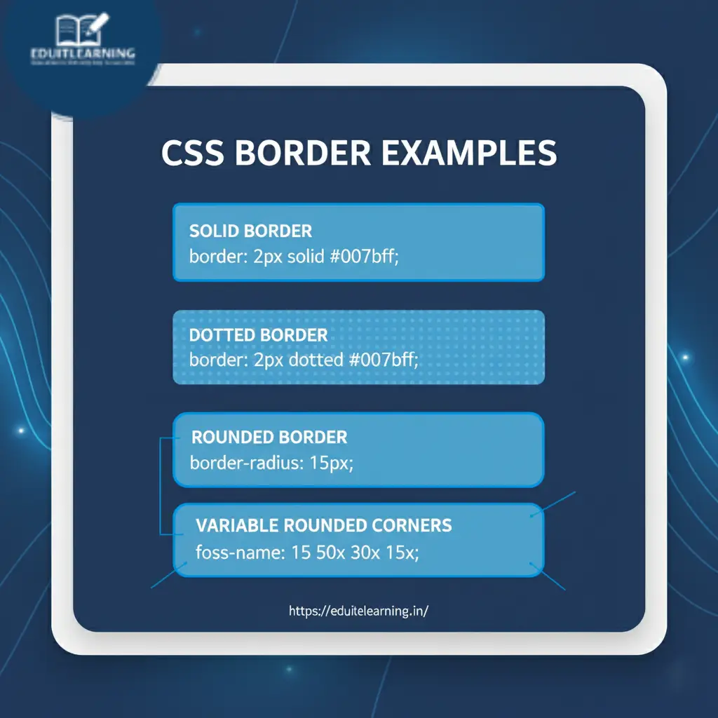
border-radius
This rounds off all 4 corners of the entire element simultaneously.
Syntax:
border-radius: value; /* px or % */px → fixed size curve
% → curve in proportion to the size of the element
Example:
<div class="rounded"></div>
.rounded {
    width: 100px;
    height: 100px;
    background-color: red;
    border-radius: 20px; /* sab corners 20px gol */
}
Result: Every corner got a curve of 20px.
Tip: border-radius: 50%; → Circle is formed if width = height.
If width = height → element becomes a circle
If width ≠ height → element becomes an ellipse
border-top-left-radius
Only the top-left corner will be rounded.
Syntax:
border-top-left-radius: value;Example:
<div class="top-left"></div>
.top-left {
    width: 150px;
    height: 100px;
    background-color: orange;
    border-top-left-radius: 30px;
}
Only the top-left corner will be rounded, the rest of the corners will be square.
border-top-right-radius
Rounds only the top-right corner.
Syntax:
border-top-right-radius: value;Example:
<div class="top-right"></div>
.top-right {
    width: 150px;
    height: 100px;
    background-color: green;
    border-top-right-radius: 30px;
}
Only the top-right corner will be rounded, the rest of the corners will be square.
border-bottom-right-radius
Rounds only the bottom-right corner.
Syntax:
border-bottom-right-radius: value;Example:
<div class="bottom-right"></div>
.bottom-right {
    width: 150px;
    height: 100px;
    background-color: blue;
    border-bottom-right-radius: 30px;
}
Only the bottom-right corner will be rounded, the rest of the corners will be square.
border-bottom-left-radius
Rounds only the bottom-left corner.
Syntax:
border-bottom-left-radius: value;Example:
<div class="bottom-left"></div>
.bottom-left {
    width: 150px;
    height: 100px;
    background-color: purple;
    border-bottom-left-radius: 30px;
}
Only the bottom-left corner will be rounded, the rest of the corners will be square.
Shorthand (4 values)
You can define radius for 4 corners in a single line:
border-radius: top-left top-right bottom-right bottom-left;
Example:
<div class="shorthand"></div>
.shorthand {
    width: 200px;
    height: 100px;
    background-color: cyan;
    border-radius: 10px 20px 30px 40px;
}
Result:
- Top-left: 10px
- Top-right: 20px
- Bottom-right: 30px
- Bottom-left: 40px
Shortcut:
- 1 value → all corners same
- 2 values → first: top-left & bottom-right, second: top-right & bottom-left
- 3 values → top-left, top-right & bottom-left, bottom-right
- 4 values → top-left, top-right, bottom-right, bottom-left
Practice project: Please try doing it yourself first. If you are unable to do it, then you can look at the code for guidance.
Most important Questions
What is a CSS rounded border and why is it used?
A CSS rounded border is created using the border-radius property to curve the corners of an element instead of keeping them square. It improves UI/UX design, makes buttons, cards, and images look modern, and reduces the harshness of sharp edges.
Example:
.box { border-radius: 15px; }How do you round all corners of an element equally?
Use the border-radius property with a single value. All four corners will get the same curve.
.box { border-radius: 20px; }- px → fixed size
- % → relative to element size, e.g., 50% creates a circle if width = height
How can you round corners individually?
Use the following properties:
- border-top-left-radius → top-left corner
- border-top-right-radius → top-right corner
- border-bottom-right-radius → bottom-right corner
- border-bottom-left-radius → bottom-left corner
Example:
.box {
  border-top-left-radius: 10px;
  border-top-right-radius: 20px;
  border-bottom-right-radius: 30px;
  border-bottom-left-radius: 0px;
}
Explain the shorthand syntax for border-radius.
You can set 1-4 values in shorthand:
border-radius: [top-left] [top-right] [bottom-right] [bottom-left];
- 1 value → all corners same
- 2 values → first: top-left & bottom-right, second: top-right & bottom-left
- 3 values → top-left, top-right & bottom-left, bottom-right
- 4 values → top-left, top-right, bottom-right, bottom-left
Example:
.box { border-radius: 10px 20px 30px 40px; }What happens if border-radius: 50% is applied to a rectangle?
If width = height → element becomes a circle
If width ≠ height → element becomes an ellipse
.circle { width:100px; height:50px; border-radius:50%; }What is the difference between px and % in border-radius?
- px → fixed rounding, independent of element size
- % → relative to element’s width and height, useful for responsive designs
.box { border-radius: 25%; } /* responsive rounded corners */How do you create elliptical corners in CSS?
Use the elliptical border-radius syntax with /:
.box { border-radius: 50px 20px / 30px 10px; }- Before / → horizontal radius
- After / → vertical radius
Creates asymmetric, modern rounded corners.
Can border-radius be used on images and buttons?
Yes. It is commonly used for:
- Buttons: softer, more clickable UI
- Profile images: circles or rounded avatars
- Cards: smooth corners
img { border-radius: 50%; } /* circle avatar */
button { border-radius: 8px; } /* soft button */
What is the relation between border and border-radius?
border-radius works in conjunction with border.
- border defines the line around the element
- border-radius defines how rounded that border is
.box { border: 3px solid blue; border-radius: 15px; }
Rounded borders will follow the border thickness and style.
Explain a professional use case of border-radius in modern UI.
- Cards: rounded corners with shadows look modern
- Buttons: rounded for easier clicking, better visual hierarchy
- Avatars: circles to highlight users
- Forms: rounded input fields for better aesthetics
Example of card UI:
.card {
  width: 200px;
  padding: 20px;
  border: 2px solid #007bff;
  border-radius: 15px;
  box-shadow: 0 8px 20px rgba(0,0,0,0.1);
}
Looks clean, professional, and corporate-ready.