Grid Template Areas
Once you’ve created a grid (with rows and columns), we can give each part (cell) a name if you want.
This name indicates which item will appear in which area. This makes your layout readable and easy to maintain.
grid-template-areas
This property applies to the Grid Container (parent). Using it, you:
- Assign an area name to each cell (row and column).
- Create a visual map-like structure.
Example:
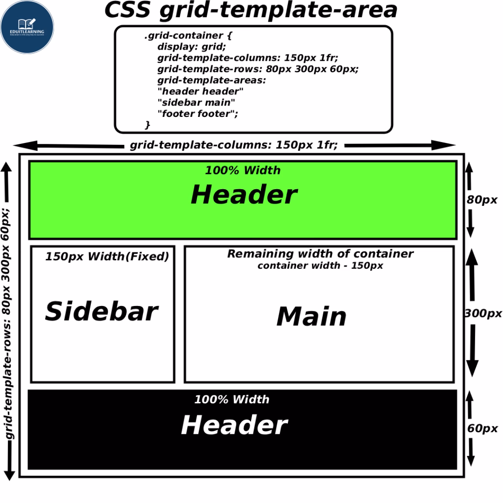
Suppose you have a layout:
- Header at the top, full width
- Sidebar on the left side
- Main content in the center
- Footer at the bottom, full width
To do this, you can write:
.grid-container {
    display: grid;
    grid-template-columns: 150px 1fr;
    grid-template-rows: 80px 300px 60px;
    grid-template-areas:
      "header header"
      "sidebar main"
      "footer footer";
  }
Explanation:
- display: grid;
- This makes the element a grid container.
- All direct child elements inside it become grid items.
- You can now arrange these items in rows and columns.
- grid-template-columns: 150px 1fr;
- Defines the number and size of columns.
- There are 2 columns:
- First column = 150px fixed width
- Second column = 1fr (fractional unit), which means it takes the remaining available space.
- grid-template-rows: 80px 300px 60px;
- Defines the number and height of rows.
- There are 3 rows:
- First row = 80px height
- Second row = 300px height
- Third row = 60px height
- grid-template-areas
- Defines named layout areas to make grid placement easier and more readable.
- The quotation marks represent rows, and the names inside represent areas.
Here’s:
- “header header” → The first row has two columns, both used by the header area.
- “sidebar main” → The second row has two columns — sidebar in the first column and main in the second.
- “footer footer” → The third row has two columns, both used by the footer area.
Final Layout will be:
grid-area
This property applies to Grid Items (child elements). Using it, you place the item in the named area you defined in grid-template-areas.
- If you don’t use grid-area in your grid items, then the areas defined in grid-template-areas will not work.
- It’s compulsory to use grid-area for each child if you want those named areas to function.
Example:
HTML:
<div class="grid-container">
<header class="header">Header</header>
<aside class="sidebar">Sidebar</aside>
<main class="main">Main</main>
<footer class="footer">Footer</footer>
</div>
CSS:
.container{
    display: grid;
    grid-template-columns: 150px 1fr;
    grid-template-rows: 80px 300px 60px;
    grid-template-areas:
      "header header"
      "sidebar main"
      "footer footer";
}
.header {
    grid-area: header;
}
.sidebar {
    grid-area: sidebar;
}
.main {
    grid-area: main;
}
.footer {
    grid-area: footer;
}
That is:
- The Header element is moved to the “header” area.
- The Sidebar is in the “sidebar” area.
- The Main element is in the “main” area.
- The Footer is in the “footer” area.
Empty cell
If you don’t want an area in a particular block, then you write a “.” (dot) in that place.
Example:
grid-template-areas:
"header header"
"sidebar main"
". footer";
Meaning:
- The first cell in the third row will be empty.
- The second cell will be the footer.
Rule to Remember:
- Every row must have the same number of columns.
- Each named area must form a perfect rectangle —
meaning, don’t place the same area name in scattered or disconnected positions.
Incorrect Examples (This won’t work):
Example 1 – Unequal number of columns in rows
grid-template-areas:
  "header header main"
  "sidebar main"
  "footer footer footer";
Problem:
Row 1 and Row 3 have 3 columns,
but Row 2 has only 2.
Grid layout becomes inconsistent — browser will auto-fill missing cells, but layout alignment will break.
Example 2 – Area not rectangular
grid-template-areas:
  "header header main"
  "header sidebar main"
  "footer footer footer";
Problem:
The header area is placed in two different rows but not forming a neat rectangle — it’s broken into an “L” shape.
Browser won’t show an error, but the header area will appear disjointed.
Example 3 – Inconsistent area shapes
grid-template-areas:
  "header header header"
  "main sidebar main"
  "footer footer footer";
Problem:
main is used in non-adjacent cells (left and right sides), forming two separate parts instead of one rectangle.
Example 4 – Scattered area names
grid-template-areas:
  "header main header"
  "sidebar main main"
  "footer footer footer";
Problem:
header appears in two disconnected spots in the first row.
It’s not one rectangular block, so the design looks uneven.